Once upon a time, there was a growing organization that had the usual challenges as new folks came on board and started trying to learn a complex domain. At the time, I imagined a product that combined UI Automation and a focus on fast feedback to serve as a safety net for these folks, but couldn’t find what I was looking for in the market. Last summer I started to build it, but ultimately didn’t get it to market.
Before it gets lost in the mists of archive.org, I thought I would try to capture some of the ideas and practices that helped me build out a complex, production system in my spare time without losing focus on user experience and the target audience.
LaunchReady Series
1. Meet LaunchReady: A SaaS Product That Almost Was
Introduction and backlog ideas I hope folks will incorporate into their products
2. LaunchReady: Focus on the Customer
Some practices that helped me see through the customer eyes
3. LaunchReady: Don't Get Distracted, Getting Stuff Done
Ignoring the distracting cool ideas to get work done
The ultimate reason it’s shutting down is not a groundbreaking discovery. Sales is a critical part of any product, especially at the beginning. Some forms of sales I have more experience in (pitching a company to prospective employees, for instance), but cold calling and getting a product to market are new to me. When I reach the beginning of 2018 and realized I had a minimum of 12+ months of being a beginner sales person in the evenings just to get to the point where I could pay myself to do it during the day, … I just couldn’t get myself over the hump to continue..
I still took away a lot from the experience and hopefully I can pass on some of the things I learned to help others chase their ideas.
Meet LaunchReady, the MVP
Meet LaunchReady, a UI Automation service designed to help fast growing SaaS companies build a broader safety net even while they’re focused on scaling and teach new team members how to add on to the software.

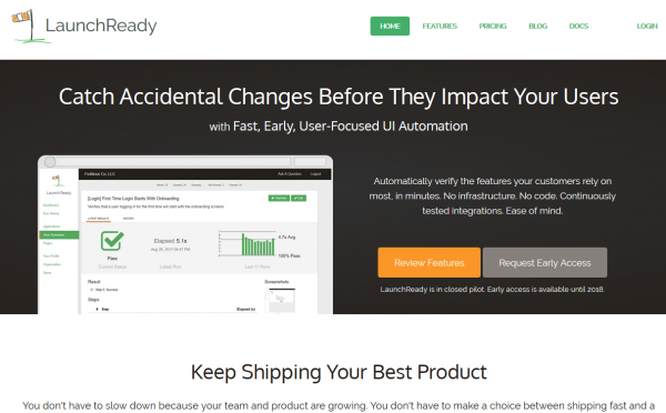
A Marketing Site, with CTAs and a touch of exclusivity and FOMO
(Ignore screenshots with a space in the name, they’re stale 🙂 )
From May 2017 to October 2017, I logged 10-20 hours/week of spare time on building a company around this idea, from market studies and financial planning to documentation, company formation, and product development.

Dynamic, Realtime Test Runs View
UI Automation testing is widely known to be fragile, complex, and time consuming. LaunchReady’s goal was to challenge all of these, for a narrow context, providing a service to support companies getting 80% of the value at no more than 5 minutes of additional delay on their build processes.

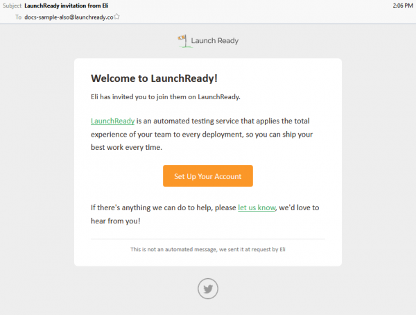
A polished user invitation email, for credibility
The eventual intent was to move these tests as close to the developer as possible, while continuing to run as parallel as the customer’s product would allow for their pipeline. It would provide near real-time feedback to developers when a change impacts known good behavior of the system, automatically produce screenshots for the public documentation when a related feature changes, and take advantage of machine learning, text analysis, image analysis, and more to provide features growing teams often don’t even realize they need yet.

Carefully chosen "User Scenario" terminology, codeless definitions
This was the MVP. It’s on par with some existing UI automation services and a little behind others. The goal was to produce a professional looking system that could scale in the cloud to minimize the time to run tests, onboard folks quickly and use patterns to reduce fragility of the tests, and make APIs a first-class citizen to integrate with 3rd party build systems. These are hard, but doable, and unlocked even more possibilities.
Steal These Ideas
First things first. If you’re building a UI Automation service, verifying the customer’s tests run is the ground floor of what you can do. If you can successfully navigate through a customer’s website, there is so much more that becomes available. Some of these (like screenshot comparison) have been showing up in the market in the last few years, but those are just the beginning.
1. Support documents are always out of date, but you can help fix that.
Provide an action or step that customers can use in tests to take a screenshot with a defined name and cropped to a specific area. Publish an API endpoint to download the images with demonstrations of scripts to download screenshots and push them into places like Zendesk’s Support Center. Maybe even offer a diff list of the images that have changed so they know what page content in the documentation also needs to be updated.
I’ve seen this problem in multiple organizations as they’ve scaled and I think this could solve the hardest part (knowing when and which docs need to be updated).
2. Warn when screens change unexpectedly
Some products have this capability already, but I include it because the next items will take it to another level.
When a test passes, compare screenshots from steps along the way to corresponding screenshots from the last passing version of the test. Report warnings or errors if the screenshots differ by more than a known amount and a way for a customer to indicate that the change is expected.
3. Warn when screens look different on different browsers
Run tests across multiple browsers at the same resolution, for instance Firefox, Chrome, and IE or a specific iPhone and Android device and browser. Report errors or warnings if the screenshots at the same resolutions are materially different. Even better, offer this with warnings before the customer even asks for it and save the day before they get the first customer call and realize they need to perform exhaustive cross-device testing somehow.
4. Automate color and contrast WCAG accessibility tests
Post-process screenshots to different color sets to simulate forms of color blindness, run a line detection algorithm across the original image and the post-processed images. Now diff the images and throw up warnings or errors if there are significant differences between the two.
5. Spellchecking
Scrape the visible text from the screen and run a spell checker, including a set of custom works the customer has flagged as ok.
6. Verify the language against it’s business domain
Scrape the visible text from the screen and use text analysis against a corpus of documents for the domain and warn or error on wording the in the application that is unrecognized or unusual for the business domain.
7. Readability of the application
Scrape the visible text and run it through analysis to check the readability/grade level of the content. Warn or error if it’s outside expected levels.
8. Suggest improved wording for the given business domain
Find phrases that are unusual for the domain (6) or don’t meet the readability expectations (7) and use text generation algorithms and a corpus of documents from the business domain to produce suggestions for improved wording.
9. Run tests by reading their support documents with machine learning services
Combining the ideas of FitNesse with the rise of cheaper tools for text analysis (like Azure LUIS), provide some general structures to the customer for writing support articles that walk through using the application, run these through a text analysis service to extract the intents as test steps, and run them as tests on every deploy. For extra points, note where screenshots are and produce updated ones automatically (per #1).
9.5 Combine your test framework with #6 and #8 and suggest improvements to their help docs
If you can scrape content from a defined test path and evaluate it against a known business domain’s common word choices and then generate improved text to a given grade level of readability for that business domain, you have a whole new product in your hands to help people write better quality help documents faster. Send me a percentage when you make it big 🙂
10. Run locally for fast developer feedback
Provide a test runner that uses the cloud test definitions to run locally on the developers system, with a small configuration file for inputs for base URL and other necessary values. Provide the ability to run subsets of the test for faster feedback. Add filewatchers to automatically run them behind the scenes (as an option). Fast , immediate feedback is the goal.
11. Automatically upgrade tests to match incoming developer changes
Once developers can run locally, they’ll see what tests break on purposes due to their changes and need to be updated. Allow them to create a new versions of the test or page definitions and save them to the central service. When running tests against the staging environment, run the officially blessed version for the trunk and, if it fails, attempt to run outstanding draft versions and promote them to the blessed version if they pass, automatically incorporating the developer test changes in when their code changes appear.
12. Display customer impact on tests
Integrate with popular customer experience and page tracking systems so you can correlate the steps in the tests with the number and frequency of end users that use the live system. Provide warnings when changes have been made to areas of the application that receive a huge amount of traffic or are touched extremely rarely to reflect risk.
13. Screen complexity
Calculate screen complexity metrics for usability and provide warnings or errors when over certain limits.
14. Workflow Complexity
Calculate workflow complexity metrics for usability as the tests walk through work flows in the application and warn or error when over certain limits.
15. “Your site just got way slower!”
Capture timing for each test and test step over time and use anomaly detection and other forms of analysis to warn when a page has suddenly gotten much slower, when it has gotten significantly slower bit by bit over a long period of time, or when there is a lot of variability in it’s timing.
Wrapping up
Some of these ideas are things I wanted to pay someone for years ago that didn’t exist. Others are common, recurring problems I’ve experienced in growing organizations. I can go deeper on any of them, so if you’re interested and building some into your product feel free to send me a note if you want an external sounding board (or prospect, for that matter).
Next in the series: LaunchReady: Focus on the Customer


 My roles have included accidental DBA, lone developer, systems architect, team lead, VP of Engineering, and general troublemaker. On the technical front I work in web development, distributed systems, test automation, and devop-sy areas like delivery pipelines and integration of all the auditable things.

