When I started LaunchReady, it didn’t even have a name. I had a general idea of what I wanted a system to do, but didn’t have a good handle on the target audience and what they would want. I had some general ideas on how to build the software affordably, but nothing with a total row at the bottom. I was excited to jump in and try to build some of the I personally wanted, but realized that led to a system that I could only describe to myself (and likely minus some very obvious features, as well).
LaunchReady Series
1. LaunchReady: Meet the SaaS Product I Almost Built
Introduction and backlog ideas I hope folks will incorporate into their products
2. LaunchReady: Focus on the Customer
Some practices that helped me see through the customer eyes
3. LaunchReady: Don't Get Distracted, Getting Stuff Done
Ignoring the distracting cool ideas to get work done
Initially, I was my target customer. This would be the product I was looking for when I scaled the engineering team at PrecisionLender. I had wanted a tool that would take all of the best learning from our core team and make it available to the new folks as they were getting up to speed. For reference, we were quadrupling the product development organization, launching a public API and third-party integrations, replatforming the entire 250KLOC front-end, refining existing features, and we added a newborn along the way for extra difficulty level…it was a busy time.
I wanted a product that focused on the fast growing, development organization that couldn’t afford to go learn and build and support a whole second product to test their first one and didn’t have experienced test automation folks on board already. And I wanted to challenge the conventions that UI Automation must be slow and fragile and hard to change.
Practices that helped define the product
At the beginning, not much of the system was clear beyond some of the features I wanted. There wasn’t a cohesive story I could tell someone, much less a product I could try to sell. There also wasn’t a clear path from that set of features to a fully working system, I could only explore so many details in my head. So it became important to identify what that system would offer to external customers, how I would explain the problem it was trying to solve, how to make it viable form a financial perspective, and what all of those necessary features were that I wasn’t thinking of while it was only in my head.
The Marketing Site
I started building the marketing site very early. This forced me to think through questions about the type of folks the product was serving, the problems they would be searching for online, and the features that had to be included from day 1 of even a pilot offering. This drove changes from the terminology, to the flow between screens, to the basic data structures behind the system.
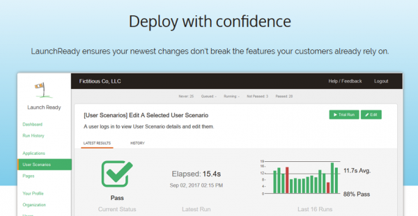
The marketing site is still up, if you’re interested: https://www.launchready.co.
Many people will tell you to put up the Marketing Site and validate the product before you build it. In this case, I built the product at the same time because I was concerned about the complexity and making sure I could connect the message with real functionality (or build exceptions back into the message).
Creating the Financial Spreadsheet
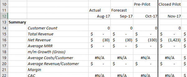
Building the financial spreadsheets and forecasts forced me to think really hard on what limits or capabilities I was going to include. There are features I wanted to include in the beginning that I realized couldn’t be included until customer #10-15 for a partial launch, or #30 for a full-scale launch. There was a valuable feedback loop between things the marketing site increased the priority on, what it took to implement them, the impact that had on the financial perspective, and back around again.

SaaS financials are a pretty widely talked about subject these days, so finding good models and articles was relatively easy. During development, I was able to keep my costs for the marketing site and production systems under $25/month while having a realistic plan to quickly turn on a pilot, add advertising, and then scale with forecasted production traffic.
Plan for customer onboarding
A key goal was to challenge the belief that UI Automation has to be fragile and complex. There is complexity in the implementation details, but I was going to have a target audience that wouldn’t have that background and needed to be able to get up to s speed and back to what they were doing very quickly (or they would give up and move on).
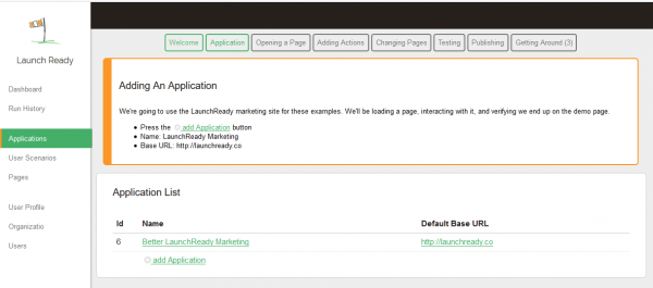
Besides the usual walkthrough in the docs (LaunchReady: Getting Started), I added a required, guided walkthrough to the application that led a first time user through adding a new application, their first user scenario, running a manual test, and reading the results from automated tests. It took 5-10 minutes and gave them a hands on introduction to the terminology and screens, in the hopes that this would give them enough tool to build their first real test and get value quickly.

First Step of Interactive Onboarding Walkthrough
I was prioritizing heavily to slice the work down for the MVP, but this seemed like a critical piece of the puzzle if I was going to get users succeeding quickly. The 5 minute target forced simplifications and changes elsewhere in the system, but when I look back these were all for the better and I could count on everyone using the system having a common minimum base of knowledge from that onboarding flow.
Next: Getting Things Done
These 3 activities helped focus on what I needed to do, but not always how to get it done at the end of an already long day. In the next post I’ll talk to some of the practices I incorporated to stop me from getting distracted by cool ideas (like those in the first post) and the general drag from working in the evenings (I’m a morning person).


 My roles have included accidental DBA, lone developer, systems architect, team lead, VP of Engineering, and general troublemaker. On the technical front I work in web development, distributed systems, test automation, and devop-sy areas like delivery pipelines and integration of all the auditable things.

