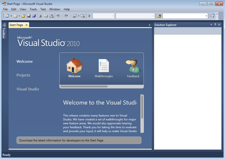
Visual Studio 2010 has been made available to MSDN subscribers yesterday. I downloaded Visual Studio 2010 today and installed it on Windows 7 RC. I took some images so that you can see what it looks like
The new welcome screen in Visual Studio 2010
In Visual Studio 2010 you can target frameworks 2.0, 3.0, 3.5 and 4.0
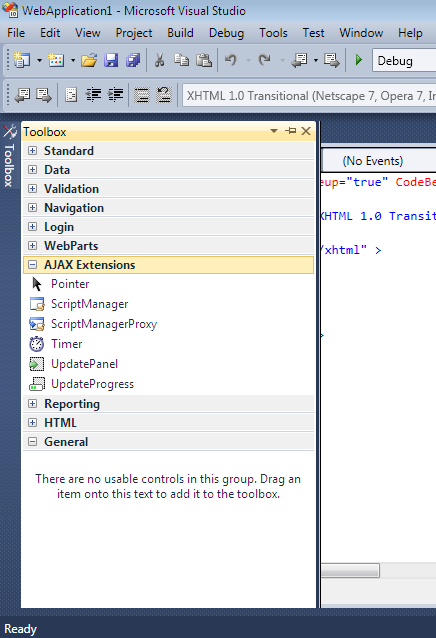
The toolbox has changed in Visual Studio 2010. it looks a lot cleaner to me. Finally we have a toolbox which does not resemble the Visual Basic 4 toolbox anymore
Finally here is what a WPF project looks like
So what do you think, do you like the looks of Visual Studio 2010?


 Denis has been working with SQL Server since version 6.5. Although he worked as an ASP/JSP/ColdFusion developer before the dot com bust, he has been working exclusively as a database developer/architect since 2002. In addition to English, Denis is also fluent in Croatian and Dutch, but he can curse in many other languages and dialects (just ask the SQL optimizer) He lives in Princeton, NJ with his wife and three kids.
