


After my review of Tableau Dashboard Cookbook, I read another book about Tableau, namely Tableau Data Visualization Cookbook by Ashutosh Nandeshwar. The book is published by Packt but I am relieved to say this time there were no significant editing issues. In fact it is quite well written and as far as I could tell there were no spelling mistakes or typos (yeah those things can really bug me out when reading a book).
The book promises "Over 70 recipes for creating visual stories with your data using Tableau". That sounds like a lot and it is, because the book (the actual content, not counting preface, indexes ...) is about 150 pages long. In other words, a little over 2 pages per recipe. In fact, I actually counted them (I have apparently nothing better to do). There are 74 recipes spread out over 147 pages, so 1.986 pages per recipe. Those are not long recipes. Some other numbers: the shortest recipe is 2 bullet points. It's about adding a wildcard filter on a worksheet, but it actually builds upon a previous recipe, so it doesn't count. The following scatter plot (created with Tableau of course) gives an overview of the various lengths of the recipes encountered in the book:

There are quite a few very short recipes, which can easily be verified with a histogram:
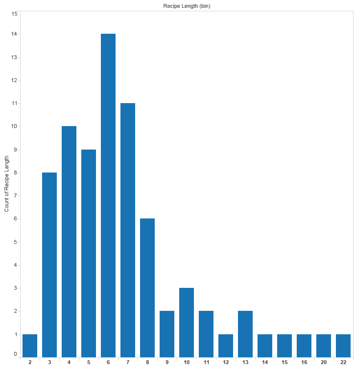
As you can notice, the distribution is a little bit skewed to the left (sorry for the sarcasm). Recipes with a length of 6 or shorter make up over 50% of the book. More statistics can be deduced from this box and whisker plot:

What is my point in all this (aside from me giving the opportunity to myself to exercise creating some charts in Tableau)? The point is that this book is short and the recipes are too basic. 74 recipes in 150 pages, clearly the choice for quantity over quality has been made. It would have been much better if the bulk of those recipes were bundled into a few recipes who were longer but also more complex and challenging. Now most of the recipes just scratch the surface of a feature and never go into any depth. They are the equivalent of a recipe for boiling potatoes:
- Peel potatoes.
- Throw them in boiling water.
- Wait for 10 to 20 minutes, depending on type of potatoes.
- Bon appétit.
Maybe in another chapter you get a recipe for cooking vegetables and in another for grilling meat, but you don't get instructions to cook a lovely meal with all of the ingredients (and now I'm hungry...). There are three chapter dealing with almost the same basic stuff: creating visualizations with one measure, creating visualizations with two measures and finally creating visualizations with multiple measures. Those should be combined in one single chapter with just a couple of interesting recipes.
Another issue is that the author sometimes doesn't bother to give more information on how the resulting visualization should be interpreted (from time to time the resulting visualization looks nice, but is rubbish from a business perspective becomes it doesn't really give useful insights). Anyway, this is just a detail. The author does include a lot of links to reference material however, which is certainly a big plus. He also gives some good advice about the different types of charts, for example what the downsides are of pie charts and stacked area charts and how to avoid them.
Conclusion
The book is way too basic and this because of the overly simplistic recipes. Get this book only if you are an absolute beginner in Tableau and have never read anything about this tool or if you are an absolute novice in data visualizations tools. In my opinion, the Tableau Dashboard Cookbook by Jen Stirrup offers considerable more depth (despite the editing issues) and you'll learn more tricks than in this book.

