


This is part five of a series about Report Builder 3.0.
- Report Builder 3.0 – The Introduction
- Report Builder 3.0 – Table or Matrix Wizard
- Report Builder 3.0 – Chart Wizard
- Report Builder 3.0 – Chart Types, Visualizations, and Properties
- Report Builder 3.0 – Report Parts
When SQL Server 2008 was introduced, it included the new spatial data types of geometry and geography. Report Builder 3.0 gave us the capability to add maps to reports, which can utilize those data types to visualize data.
The Map Wizard in Report Builder 3.0 provides a simple way for you to create a map or map layer, tying it to spatial data. To begin, you need to understand that a report needs spatial data, to show the points you’re trying to display, and can have analytical data, to show more information. I’ll walk you through using the wizard to create a simple two-layer map that shows the sales (analytical data) per AdventureWorks store (spatial data) in the state of New York.
The Chart Wizard can be accessed in two ways. It will appear on the splash screen when you open Report Builder. It can also be found under File > New.
The Wizard
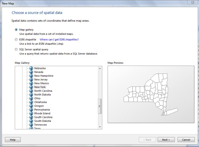
Choose a source of spatial data
First, you need to choose where your data will come from.
- Map gallery – These are predefined maps provided by Microsoft. They are .rdl files saved on your local computer.
- ESRI shapefile – These are a set of files that conform to the ESRI Shapefile spatial data format.
- SQL Server spatial query – You can reference the geometry or geography data types in a SQL Server database. (I will show this in a later example.)
Select Map Gallery, expand USA, expand States by County, and select New York.
Choose spatial data and map view options
- Map resolution – You can choose quality on a scale from best quality or smallest size.
- Embed map data in report – This option allows you to embed map elements that are used in the map layer. This is a default for the Map Gallery.
- Crop map as shown above – Pan and zoom the map using the controls on the left. Once you have it set, you can check this option for a default view of the map.
- Add a Bing Maps layer – This option adds in a Bing map tile which will provide a geographic background for the map view.

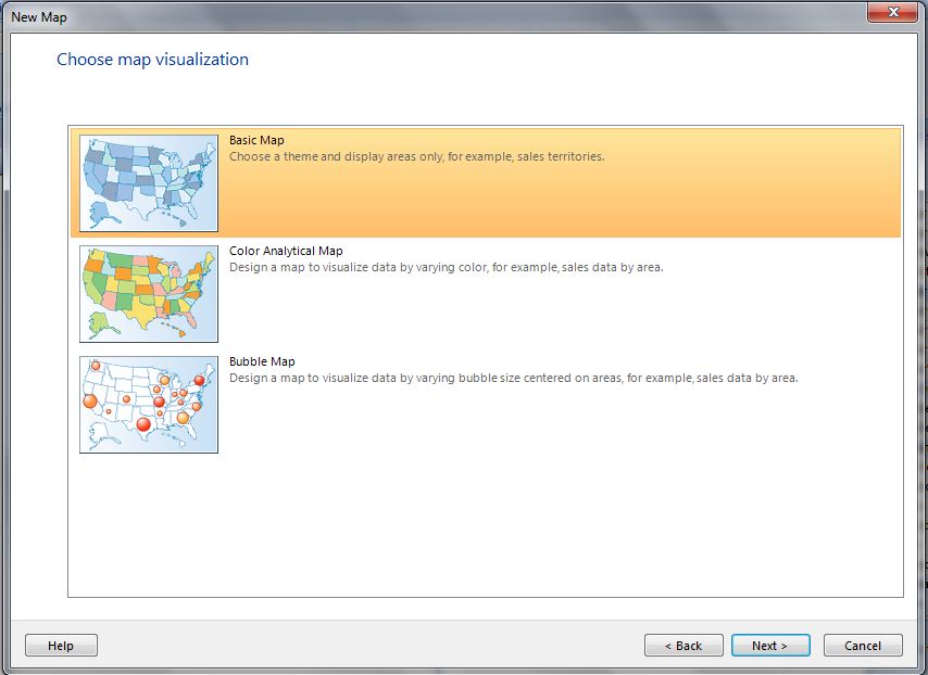
Choose map visualization
- Basic map – This displays locations – spatial data – only.
- Color analytical map – This displays data – analytical data – by color.
- Bubble map – This displays data – analytical data – using bubbles that vary in size, relative to the changes in the data.
Choose Basic map and continue.
Choose color theme and data visualization
- Theme – The theme determines the color scheme of the background, legend, and other parts surrounding the map.
- Single color map – This will make all regions of the map the same color.
- Display labels – This will show data points on the regions.
Choose Single color map and Display labels. Select the label #COUNTYNAME.

When you click Finish, you’ll be taken to the Report Builder main screen.
You can click on “Map Title” to change this.
When you click anywhere on the map, the Map Layers screen will pop up. Here, you can add a layer; delete a layer; access properties; shift the map view up, down, left, or right; and adjust the zoom level.

Running the report right now will result in a map of the state of New York, with the names of a few counties displayed. We need to add a dataset to tell the report what data to display.
I’m going to use AdventureWorks2008R2. You’ll need to go to your database and create this view:
CREATE VIEW NYStoreSales AS SELECT ST.Name, ADDR.addressid, ADDR.City, SP.StateProvinceCode, SUM(SOH.TotalDue) AS TotalDue FROM person.Address AS ADDR INNER JOIN person.stateprovince AS SP ON SP.StateProvinceID = ADDR.StateProvinceID INNER JOIN Person.BusinessEntityAddress AS BEA ON BEA.AddressID = ADDR.AddressID INNER JOIN Sales.Store AS ST ON ST.BusinessEntityID = BEA.BusinessEntityID INNER JOIN Sales.Customer AS CUST ON CUST.StoreID = ST.BusinessEntityID INNER JOIN Sales.SalesOrderHeader AS SOH ON SOH.CustomerID = CUST.CustomerID WHERE SP.StateProvinceID=54 GROUP BY ST.Name, ADDR.addressid, ADDR.City, SP.StateProvinceCode ;
Double-click the map to bring up the Map Layers screen, and click the New layer wizard button.

Choose a source of spatial data
This time, choose SQL Server spatial query.

Choose a dataset with SQL Server spatial data
Select Add a new dataset with SQL Server spatial data and click Next.

Choose a connection to a SQL Server spatial data source
I am going to use my pre-configured AdvWorks2008R2 dataset.

Design a query
(I covered this screen in-depth in my Table or Matrix Wizard blog.) Select “Edit as Text” and add the following query:
SELECT NYS.Name, NYS.City, NYS.TotalDue, ADDR.SpatialLocation FROM NYStoreSales AS NYS INNER JOIN Person.Address AS ADDR ON ADDR.AddressID = NYS.addressid;
![][8]
Choose spatial data and map view options
- Spatial field – Make sure this is set to the field in the query that contains the spatial data, SpatialLocation.
- Layer type – Choose Point, to display one point. A polygon would outline and area, and line could be used to mark a path.
You won’t “Embed map data” or “Add a Bing Maps layer” on this layer, in this example.

Choose map visualization
This time, choose Analytical Marker Map.
![][9]
Choose the analytical dataset
Pick the dataset you created earlier, which has the spatial data in it.
![][10]
Choose color theme and data visualization
- “Use marker types” will add pin shapes at the points on the map.
- “Use marker sizes” will size the points differently, based on the data.
- “Use marker colors” will color the points on the map differently.
Use marker types, based on City, and marker colors, for the SUM(Sales).
![][11]
Click Finish and you’ll be taken back to the main screen. Now, you can see two layers have been added to the map.
![][12]
Click Run to view the results.
Here, you’ll see a point for each city that has a store. Each point has a different marker (circle, square, pin, etc.) The color of the marker is going to vary based on the amount of sales – the lowest (Endicott) is white, the highest (Melville) is red.
![][13]
Maps are a great addition to Report Builder 3.0. You can easily align data from sales, customers, products, campaigns, or even the miles you’ve run each week with built-in maps. This takes reporting to a new level.
This was a very basic introduction – there is much more you can accomplish with maps. Check out these additional resources for more information!
http://technet.microsoft.com/en-us/library/ee240845.aspx
http://technet.microsoft.com/en-us/library/ee240751.aspx
[8]: https://lessthandot.z19.web.core.windows.net/wp-content/uploads/users/grrlgeek/RB3 MapWiz11.JPG?mtime=1332902571 [9]: https://lessthandot.z19.web.core.windows.net/wp-content/uploads/users/grrlgeek/RB3 MapWiz12.JPG?mtime=1332902571 [10]: https://lessthandot.z19.web.core.windows.net/wp-content/uploads/users/grrlgeek/RB3 MapWiz13.JPG?mtime=1332902572 [11]: https://lessthandot.z19.web.core.windows.net/wp-content/uploads/users/grrlgeek/RB3 MapWiz14.JPG?mtime=1332902573 [12]: https://lessthandot.z19.web.core.windows.net/wp-content/uploads/users/grrlgeek/RB3 MapWiz15.JPG?mtime=1332902573 [13]: https://lessthandot.z19.web.core.windows.net/wp-content/uploads/users/grrlgeek/RB3 MapWiz16.JPG?mtime=1332902573
 Jes Borland is a Premier Field Engineer - SQL Server for Microsoft, where she is a trusted technical adviser, deep technical support, and teacher for her customers. Her experience as a DBA, consultant, and 5-time Data Platform MVP allow her to help the business and the IT teams reach their goals. She has worked with SQL Server as a developer, report writer, DBA, and consultant. Her favorite topics are administration, automation, and performance. She frequently presents at user groups, SQL Saturdays, and other community events. She is also an avid runner and chef.
