Over my years in (and before) IT, I’ve seen long projects, failed projects, confused projects, wildly successful projects, and even fun projects that ended far differently than we expected. The consistent take-away for me is that I am a big picture type of person, and that understanding that big, abstract picture cuts out a lot of wasted time sprinting down the wrong paths.
Creating a model forces me to refine a concept down to it’s simplest elements, forces me to face the unknowns that my mind has so casually been skipping over. When done well, a model communicates a clear idea and replaces not only the thousands words required to explain it, but the 9000 I would have wasted getting there.
I model to think through processes, question my assumptions, and provide guidance towards a solution. While it probably looks like something I threw together in about ten minutes, there are actually a lot of processes going on behind the scenes.
Purpose – What are We Drawing?

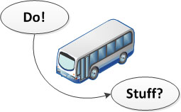
No Goal? Here's a Diagram.
As with all things, a diagram should have a goal. A model that isn’t trying to communicate an idea is filler for a report no one is going to read anyway. A goal should be concise and limited to a single subject or perspective:
- The data flow from the end customer to our master data system
- An order-to-cash business process
- The functional architecture of a software application
- A graphic representation of our current state
Mess around with too many factors and at the end of the day a mess is all you’ll have:
- The physical network topology combined with the disaster recovery plan and data flows between the systems
- The application architecture with defined user work flows and user experience elements
Or to translate: gobbledygook.
Constraint – Less is More
A goal provides me with my first constraint, and constraints are good. Defining constraints will keep my model simpler and consistent, which means the end message will be clearer. At the same time, a well-defined set of constraints will encourage creativity, providing a better end product.
Often my constraints will include things like not allowing connections to cross, only using a very simple set of shapes, restricting myself to only a few shades of color, or setting time limits. I’ll define the perspective I want to use with my goal, whether it will be a topological map, a flow, or just a set of connected shapes.
This keeps me focused instead of playing with the entire palette of colors, shapes, and page sizes available in my favorite software tools.
Content – Work on a Temporary Surface
Even with constraints and a goal, I still don’t know exactly where I will end up or what I will learn along the way, so I start on the whiteboard. With a whiteboard I can start diagramming out the pieces I know, add in new items or resolve question marks as I run into them, and easily combine and rearrange my thoughts. Some of my constraints will be ineffective at this stage, but natural constraints (like the number of markers I have and the board size) will replace them in helping my creativity and thought processes.
This stage is also where I figure out my wording. Because it’s so easy to see the big picture (heh) on my whiteboard, I also get a good feel for when words are too specific, not specific enough, or possibly just not quite the right word for what I am trying to communicate. Instead of focusing on getting all the boxes lined up, I can focus on using clear and consistent terminology that will help support the final model rather than detract from it.
Medium – Where is it Going?

Content needs Context
As I make the transition from whiteboard to diagramming software, the last piece of the equation is to consider the medium I am going to use to communicate the model. A standalone diagram may put higher priority on further simplicity of shapes and colors, where a presentation model may put lower priority on text and higher priority on subtleties for deeper conversation.
Will there need to be a legend? Is font-size 8 going to be a waste of time or readable font? If I use subtle shades of color will it all print the same color or show up in gloriously rendered imagery on a 12 foot display? Will adding a cartoon get a chuckle in a presentation or a frown in an executive review? Can I include a picture of my cat?
The context the diagram will be communicating in will determine the last set of constraints.
Terminology – The Wrong Word Invalidates the Model
General wording may have been roughed in on the whiteboard and some really good words may have been chosen, but these now need to be examined in light of the future medium as well as the audience. In many cases, using a word out of context can distract my audience or even negate the model’s message entirely.
That being said, endless anxiety over perfection is nowhere near as good as a cool beer at the end of a work day, so we need to strike a balance between working through the night and achieving good enough. So I’ll be careful, in general, when using customer terminology and try to be pragmatic in my search for the perfect name for the third box from the left.
Composition – Additional Layers of Meaning
The last stage of the model, having transferred it from whiteboard to software and applied corrections to terminology, is to add some depth that supports the initial concept.
Colors, re-arranging layout to alter proximity, fonts, and even line thicknesses are all tools I use to add subtle depth to a model. If I am planning on presenting the model, I can start the discussion on the general message of the model and dive into these subtleties as the discussion progresses. A thicker line between two systems can communicate greater bandwidth or a more secure transport layer. A common shading of colors between multiple objects communicates a relationship or similarity. As with the stages before, I try to use constraint. Applying the whole palette and a different shape for each object may seem fun, but it’s going to communicate confusion (and possibly a desire for medication).
While working with the composition, I will also create temporary versions to play with drastically different layouts or shapes. This gives me a fresh look at a concept that has undoubtedly been on my whiteboard for days, giving me an opportunity to catch last minute holes or simply provide alternative layout options.
Sounds Like a Lot of Work…
There are different levels of work involved in modeling. In some cases even finding the time to stop doing and try to draw an idea may seem like a waste.

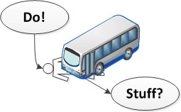
Not looking ahead?
Diagram for that too...
5 Minutes: If it only takes five minutes to draw a fast diagram of what I am intending to do, then that 5 minutes didn't cost much and I can move forward with confidence.
30 Minutes: If it takes 30 minutes, I've erased and redrawn half of it, and the person I am explaining it to is still arguing with me, then it's time to draw a model.
3 Hours: If it takes 3 hours, we end with more questions than we started with, half the questions have the potential for refocusing the project, and we're still trying to figure out what to call this thing...yeah, it's definitely time to get a handle on what we're spending time on.
<p>
  Jumping right into any project when we can't draw a high level summary means we're spending time and resources on something we can't adequately define. It doesn't matter how fast we're moving if we're spending that time running in random directions and ignoring cross-traffic.
</p>


 My roles have included accidental DBA, lone developer, systems architect, team lead, VP of Engineering, and general troublemaker. On the technical front I work in web development, distributed systems, test automation, and devop-sy areas like delivery pipelines and integration of all the auditable things.

