


I built my first website for the NCSA Mosaic browser. A lot has changed since then, and the challenges we had with the original browser wars are upon us again as we try and build sites that work equally well on a variety of mobile phones, tablets, and the desktops that originally gave us so much trouble. Like the browser wars, the two main approaches have been server-side and client-side, with the server-side approach using the browsers User Agent to serve up a browser-specific response and the client-side method being an attempt to serve up one version of HTML that works on all potential browsers.
While the server-side method has not gotten much more advanced, the client-side methods are generations beyond where we used to be. Responsive Web Design and Adaptive Web Design provide the methods to use CSS and javascript to produce site that scales and progressively enhances to meet the end users device capabilities.
A couple months ago I decided to redesign my personal website again, with the goal of making it provide a good experience at mobile phone, tablet, and monitor sizes. Here’s how I did it.
The Screen Sizes
I decided to focus on screen sizes starting at mobile phone (480px or less) all the way up to large browser (more than 1240px). Each resolution would be usable and contain a similar palette and graphical elements. I also attempted to minimize the amount of extra elements I load at the smaller sizes, assuming that these smaller sizes would have less (and more costly) bandwidth.
These are the layouts I ended up with:

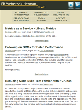
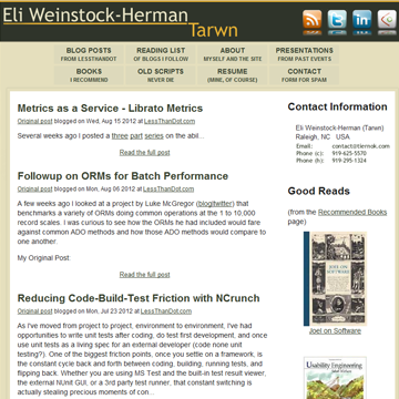
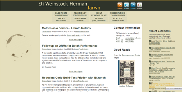
As the available screen real estate gets larger, the logo size increases, the number of social icons increase, and additional inner right sidebar appears, and then finally additional background and an outer right sidebar become available. The width of the available reading area scales smoothly from the smallest size to the largest size.
Implementation
While my site doesn’t have a lot of functionality, achieving the layout changes and addition of features at the largest sizes was still a nice challenge. The key to the site is the CSS media queries that alter the visibility of elements and areas, combined with some javascript to load in larger images or additional elements when relevant. In the event that a browser doesn’t support media queries and javascript, they will receive the smallest possible layout. Though there are workarounds, I purposefully left the IE8/IE7 layout in this mode, which would also be used for most mobile browsers.
If you load the site in the secondary window and drag the width around, you will be able to see the transitions: http://www.tiernok.com
Images
I cheated a bit on images. Any image with the “imglow” CSS class will be hidden above 480 px screen width and replaced with ones that with a class “imghi”. Since many small browsers would load the large image even if it is hidden, I put the actual image source in a data attribute and use a bit of javascript to populate the src value.
The social images at the top of the screen have classes that define whether they are available for small resolution or not and display at half resolution in smaller screens. These don’t load dynamically at larger size, so all 4 will load on browsers that load hidden images.
The background coffee spills start to show at the medium resolutions via positioned background images on the main content wrapper, so these only load when the screen is large enough to display them. This is also when the inner right side panel is displayed, along with the contact image and books. This content is loaded and not displayed at smaller resolutions, so there is some room to shrink that initial mobile load further.
CSS Media Queries
The main CSS logic is as follows:
> 480 pixels wide:
- Hide the small logo, show the large one at reduced size
- Increase the size of the 2 social icons in the header
- Switch navigation from bar to buttons, show more links
- Switch from full screen to fixed borders for main content
> 650 pixels wide:
- Show the large logo at larger size
- Show all 4 social icons
- Add last two links to navigation
> 750 pixels wide:
- Show the large logo at largest size
- Show inner right sidebar
- Constrain main body to 800px wide
- Add coffee stain background images
> 1000 pixels wide:
- Add constraints to content wrapper and area to maintain smooth centering
> 1240 pixels wide:
- Show the outer right sidebar (javascript used to load content asynchronously)
Minimizing the pages that were available at the smaller resolutions not only kept the content more focused, but also meant that some of the more complex pages (like the resume) would only be available at resolutions that would support them.
Am I Happy With It?
I started the redesign with the Html5 boilerplate to give me a consistent start place and minimize how much time I had to deal with browser specific layout tweaks. I did tweak the media query resolutions quite a bit as I built out the pages, but part of this was my lack of designer skills and not having a clear enough picture of what I wanted the site to look like.
Currently a mobile device without javascript will load about 83KB of content (obviously this changes based on what is on the front-page of the site). With Javascript this goes up to 160KB for mobile and 800 ×600 resolutions and 200KB for the largest screen size. I think the smaller resolutions could be reduced further by restricting the inner sidebar content and small icon loading, and the whole site could do with some minification and gzip.
Overall I am very happy with it. The size is usable at every resolution I try and this method doesn’t rely on the client-side user agent. Additional functionality would be easy to add, as I could use feature detection to add functionality only if the end user’s browser supported it, regardless of the user agent string. I’m very happy with the result.
 My roles have included accidental DBA, lone developer, systems architect, team lead, VP of Engineering, and general troublemaker. On the technical front I work in web development, distributed systems, test automation, and devop-sy areas like delivery pipelines and integration of all the auditable things.


