


Introduction
Since I’m on vacation and I have nothing better to do I decided to make a mobile version of our blogs. Not only because it’s fashionable but also because old people will have a hard time reading this site on a smartphone and to save bandwidth in bandwidth deprived countries like Belgium (250MB/month costs 10€). So I set about and read some things about [jQuery Mobile][1]. They are up to alpha 4 already so I expect a few betas soon. There are lots of demos and good documentation on their site. Not all OSS have bad documentation.
I have not yet put the site up but I will set it up this week for everyone to test.
The index
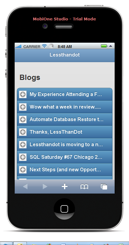
First I needed to create an index page which would show the tittle of the latest blogposts. This is what it looks like on an iphone emulator.
First thing to know is that you add the jQuery and jQuery Mobile references and that it uses HTML 5 to do it’s magic.
<head>
        <link rel="shortcut icon" href="favicon.ico" type="image/vnd.microsoft.icon" />
	    <link href="http://code.jquery.com/mobile/latest/jquery.mobile.min.css" rel="stylesheet" type="text/css" />
        <script src="http://code.jquery.com/jquery-1.6.1.min.js"></script>
        <script src="http://code.jquery.com/mobile/latest/jquery.mobile.min.js"></script>
        <title>Mobile version of Lessthandot</title>
    </head>
I used the latest unstable release here, I might change that in the future when they do release.
Then I used a page.You simply define it like this.
<div data-role="page" data-theme="b"></div>
The data-role tag tells it this is a pag and the data-theme let’s you choose from 5 themes already there but you can make your own if you so desire.
Then we define a header.
<div data-role="header">
 <h1>Lessthandot</h1>
</div>```
Again we use data-role of type header this time.

After that you have the content data-role to add your…content. And I added a title.

```html
<div data-role="content">
<h2>Blogs</h2>
             ```
After that it was time to add the items. I choose a collapsible set.
<div data-role=“collapsible-set” data-collapsed=“true”>``` Which gave me the possibility to add excerpts to it and a more button to open the post.
The list and individual items would look something like this.
<div data-role="collapsible" data-collapsed="true">
<h3>title</h3>
<p>excerpt</p>
<div data-inline="true"><a href="index.html" data-role="button">More</a></div>
</div>```
I guess by now you can see what it is doing.
I also added a footer for paging on the page.
Which looks something like this.
<div class="image_block">
<a href="https://lessthandot.z19.web.core.windows.net/wp-content/uploads/users/chrissie1/jquery/jquerymobile3.png?mtime=1308553752"><img alt="" src="https://lessthandot.z19.web.core.windows.net/wp-content/uploads/users/chrissie1/jquery/jquerymobile3.png?mtime=1308553752" width="413" height="781" /></a>
</div>
And here is the code.
```html
<div data-role="footer" class="ui-bar">
<a href="mobileindex.php?page=1" data-role="button" data-icon="arrow-l">Previous</a>
<a href="mobileindex.php?page=3" data-role="button" data-icon="arrow-r">Previous</a>
</div>```
Look at how you can easily add the icons to it.
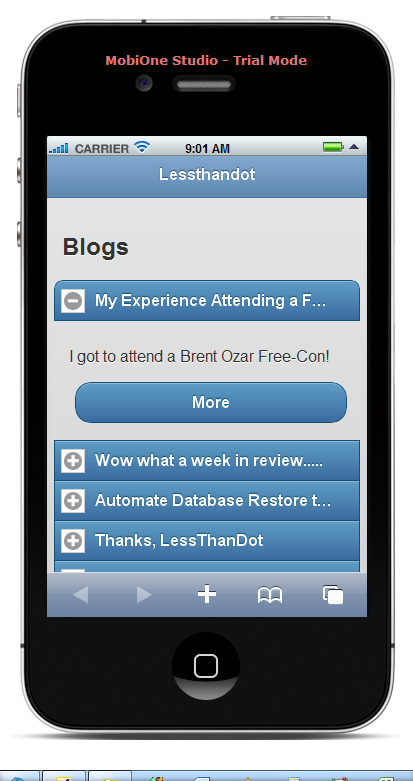
Then I made something similar to show the post.
<div class="image_block">
<a href="https://lessthandot.z19.web.core.windows.net/wp-content/uploads/users/chrissie1/jquery/jquerymobile4.png?mtime=1308553930"><img alt="" src="https://lessthandot.z19.web.core.windows.net/wp-content/uploads/users/chrissie1/jquery/jquerymobile4.png?mtime=1308553930" width="413" height="781" /></a>
</div>
The code for that is pretty much the same. as the above.
## Conclusion
Working with jQuery Mobile is pretty simple and documentation is very good. The only thing to do now is to resize the images so that they fit better on the little screen.
[1]: http://jquerymobile.com/
 Chris is awesome.