


Charts in SSRS are invaluable – they allow you to view data graphically. It is much easier to tell a story with pictures than with text and numbers.
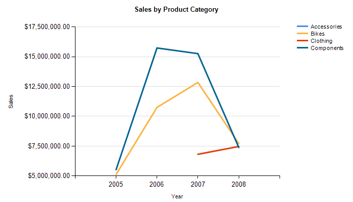
SSRS has a default set of color combinations for charts. Let’s face it, they aren’t pretty. Here’s a sample line chart. The default color palette is “BrightPastel”.
What if those colors don’t work for you? Maybe you want a lighter or darker palette. Maybe you want to incorporate corporate colors. Maybe the budding interior designer in you is emerging. Can you change them? Yes!
In SSRS, you can define custom color palettes in reports, allowing you to change the colors in a chart.
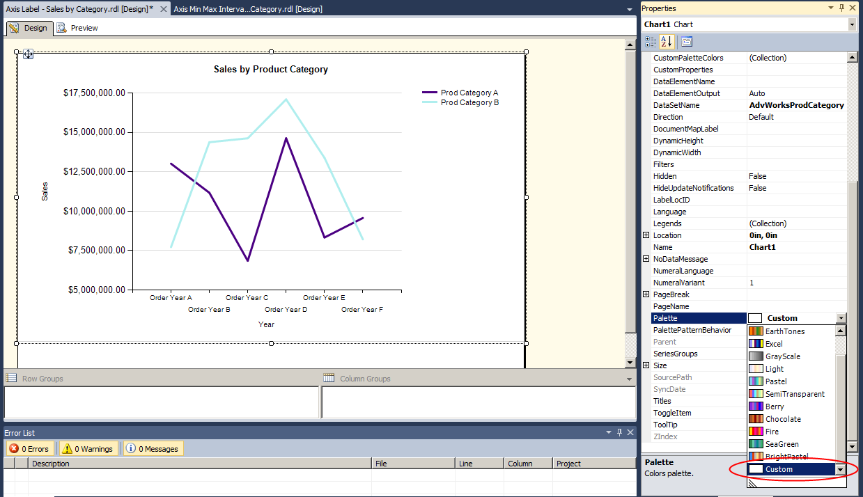
In Report Builder, click on the chart and go to the Properties window. Select the Palette property drop-down. Choose Custom.
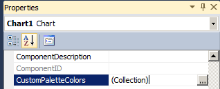
Then, go to the CustomPaletteColors property and select the ellipses (…).
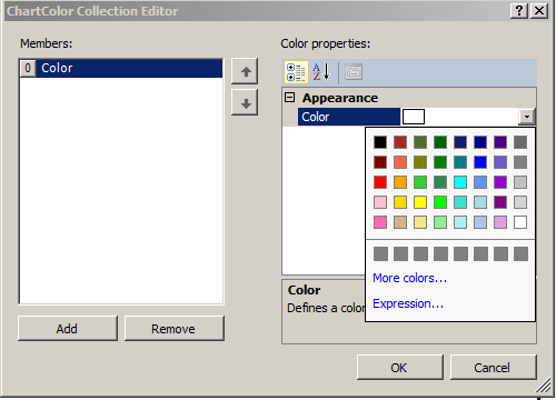
The ChartColor Collection Editor will appear. What you want to do here is select the colors you want to use in your charts.
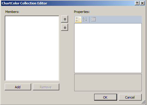
On the left, under Members, click Add. Color 0 will be added to the Members list. On the right, under Color Properties, click the drop-down arrow to select a color. You can choose from the pre-defined palette, or choose More Colors to see an expanded palette or enter an RGB value.
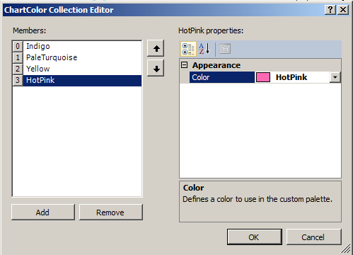
I’ve added four colors – Indigo, Pale Turquoise, Yellow, and Hot Pink.
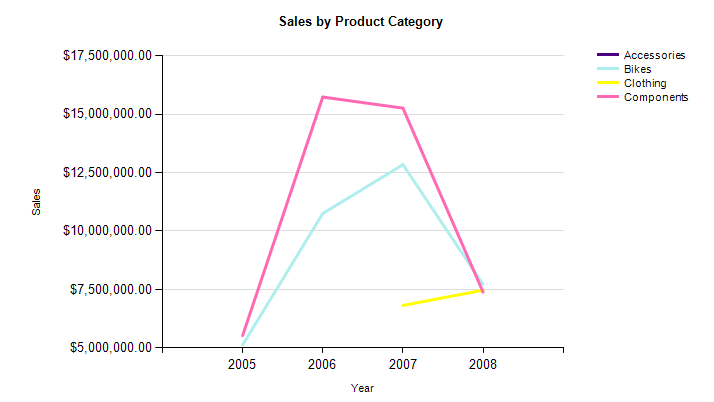
When I click OK and then Preview my report, I can see the newly defined custom colors are being used!
The only down side to this is that custom color palettes are report-specific. I know of no way to save and re-use them in other reports.
 Jes Borland is a Premier Field Engineer - SQL Server for Microsoft, where she is a trusted technical adviser, deep technical support, and teacher for her customers. Her experience as a DBA, consultant, and 5-time Data Platform MVP allow her to help the business and the IT teams reach their goals. She has worked with SQL Server as a developer, report writer, DBA, and consultant. Her favorite topics are administration, automation, and performance. She frequently presents at user groups, SQL Saturdays, and other community events. She is also an avid runner and chef.

