


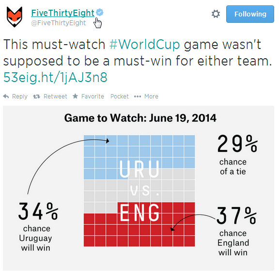
With “Matrix Infographic” I simply mean those infographics FiveThirtyEight (site | Twitter), the website of statistic revelation Nate Silver, uses to display forecasts of World cup matches. An example:
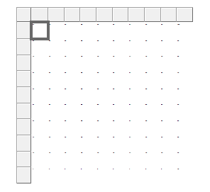
I was wondering if something similar could be built using SSRS. And yes, it is possible and it isn’t that hard. My starting point is a 10 by 10 matrix I downloaded from a blog post by Jason Thomas (blog | twitter). He uses this matrix in his 24 hours of PASS session “DataViz You Thought You Could NOT Do with SSRS”, which is an absolute must-watch.
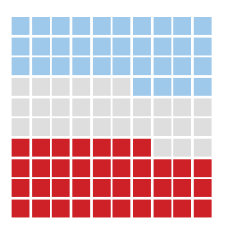
Each cell has a unique number and we start with 1 in the left bottom corner and we end with 100 in the top right corner. The font is set extra small, so that the column that contains 100 is not resized because of the 3 digits.
The source query (complicated right?):
SELECT
	 BottomStart	= 0 -- England wins
	,BottomEnd		= 37
	,MiddleStart	= 38 -- Tie
	,MiddleEnd		= 66
	,TopStart		= 67 -- Uruguay wins
	,TopEnds		= 100;
So we have 3 ranges: bottom, middle and top.
The colors of the matrix are assigned according to the values in the source query. Now, we’re not going to create 100 expressions, so we select all of the cells of the matrix by clicking on one cell in the corner, holding shift and then clicking on the opposite corner.
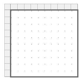
Now we can create one single expression for all of the cells using the Me placeholder.
=iif(Me.Value <= Fields!BottomEnd.Value,"#CD2027",iif(Me.Value >= Fields!MiddleStart.Value And Me.Value <= Fields!MiddleEnd.Value,"#DEDEDF","#9FC9EB"))
The hexadecimal values are the colors I extracted from the FiveThirtyEight tweet using a color picker. When we run the report we get our result:
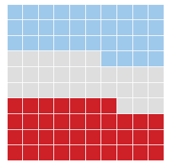
Pretty easy right? If you want the borders smaller or thicker, you can play with the border width.
The only thing that is not possible is all those fancy labels. Sure you can use textboxes in SSRS, but SSRS kind of hates it when objects overlap. And drawing arrows is pretty impossible, unless you dive deeply into custom code.
If you want to learn more about matrix infographics, check out the 24HOP session by Jason Thomas I mentioned earlier.

